There’s a distinct sensation that accompanies the unboxing of a new Tudor timepiece, a feeling that has become increasingly familiar: the impression of a genuinely strong design that has reached approximately 90% of its potential, halting just before the final polish that would elevate it to undisputed excellence. This observation, however, should not be misconstrued as a critique of Tudor’s overall quality. The brand is renowned for its robust construction and has demonstrably focused on delivering high-quality Swiss watches at accessible price points in recent years. Yet, a recurring pattern of design choices often seems to suggest a moment of hesitation or second-guessing within the brand’s creative process, where an optimal idea might have been ultimately sidelined. This can manifest in various forms, from an unexpectedly thick case profile to an unconventional lume hue or an unusual dial color, creating a subtle dissonance within an otherwise compelling aesthetic.
This perceived pattern, observed across a significant portion of Tudor’s recent catalog, appears too consistent to be mere coincidence. Models such as the Black Bay Pro, the recently introduced 39mm Black Bay Chrono with its distinctive yellow dial, and the Ranger, all showcase powerful core designs that are subsequently tempered by smaller, arguably less impactful decisions. While these choices might strike some enthusiasts as peculiar, they could, of course, be rooted in specific design rationales that resonate differently with individual perspectives. This article aims to explore this phenomenon, examining instances where Tudor’s design execution, while commendable, seems to fall just short of realizing its full, unblemished potential.
A Fan’s Perspective: Examining the "Almost" Phenomenon
It is crucial to preface this analysis by stating that the watches discussed herein are by no means flawed or inferior timepieces. On the contrary, many are considered among Tudor’s finest offerings. The very strength and desirability of these models make this recurring design characteristic worth dissecting, not as a dismissible inconsistency, but as a potential hallmark of the brand’s creative strategy or perhaps a deeply ingrained design habit.
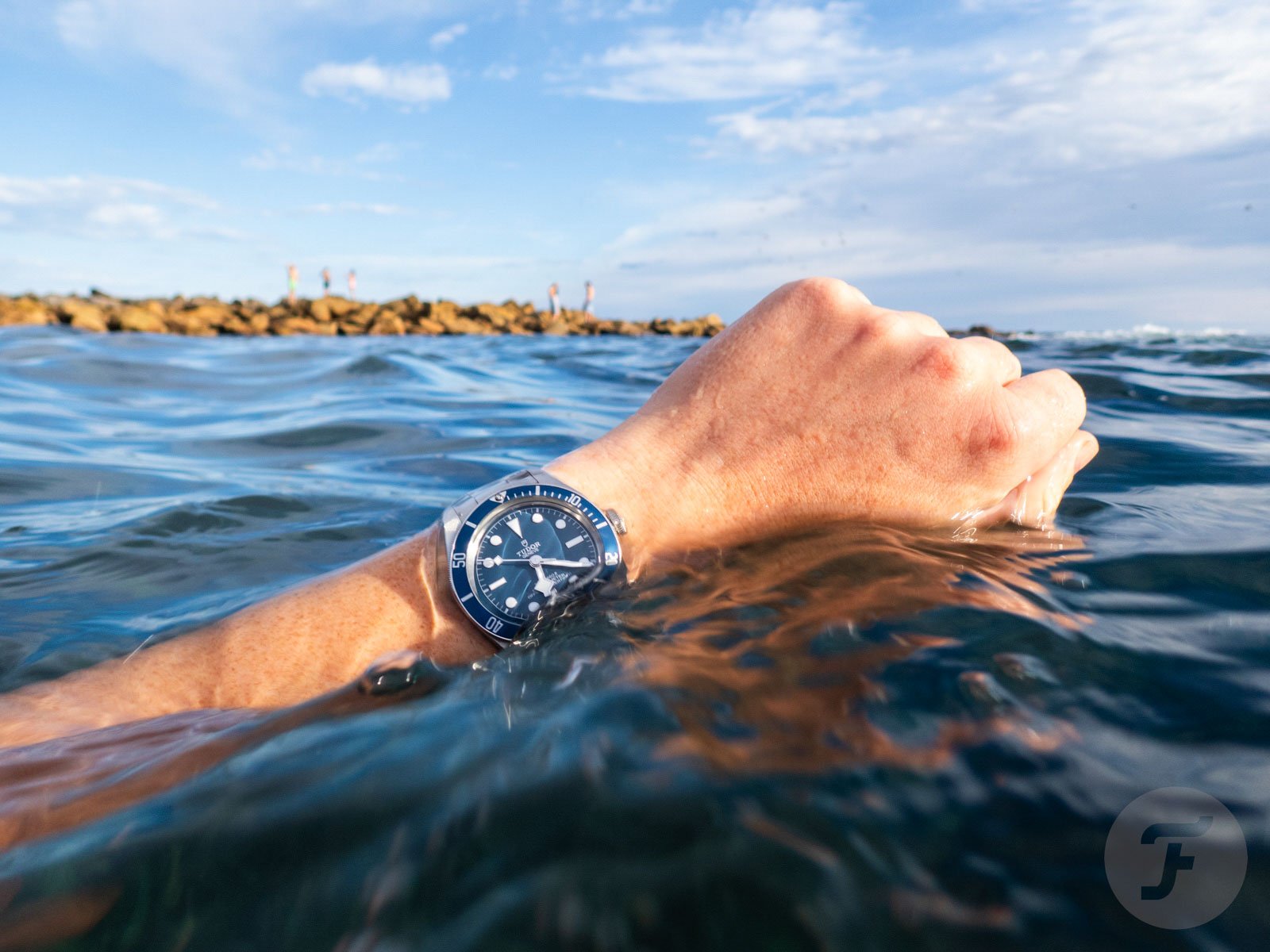
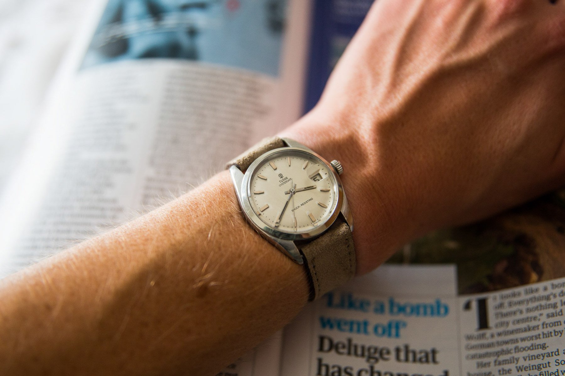
As an owner of both a contemporary navy Tudor Black Bay 58 and a vintage Tudor Oysterdate, my appreciation for the brand is well-established. This examination is not intended as a disparagement of Tudor or its parent company, Rolex. Instead, it seeks to articulate an observation that appears to be shared by a notable segment of the watch enthusiast community, suggesting that this pattern is a recognized aspect of Tudor’s contemporary product development.
The Black Bay Pro: A Tribute with a Hesitation
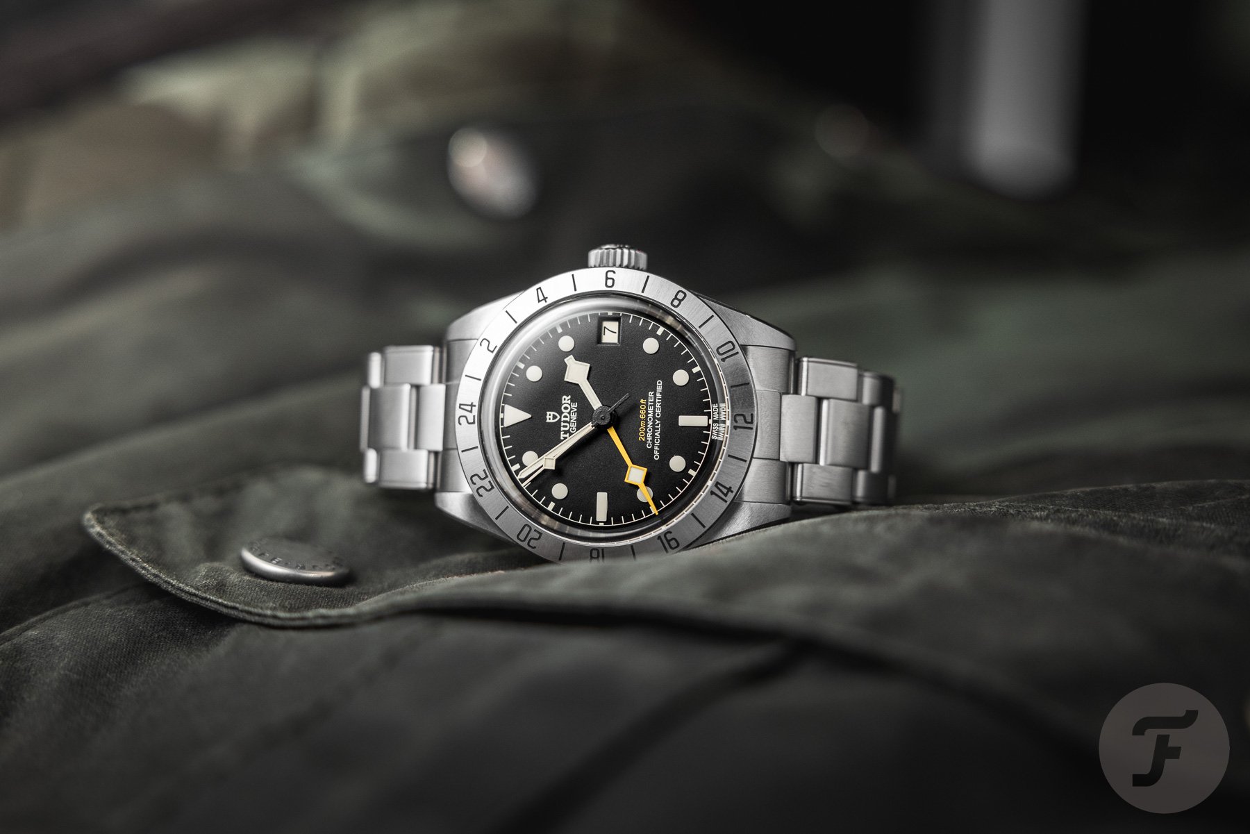
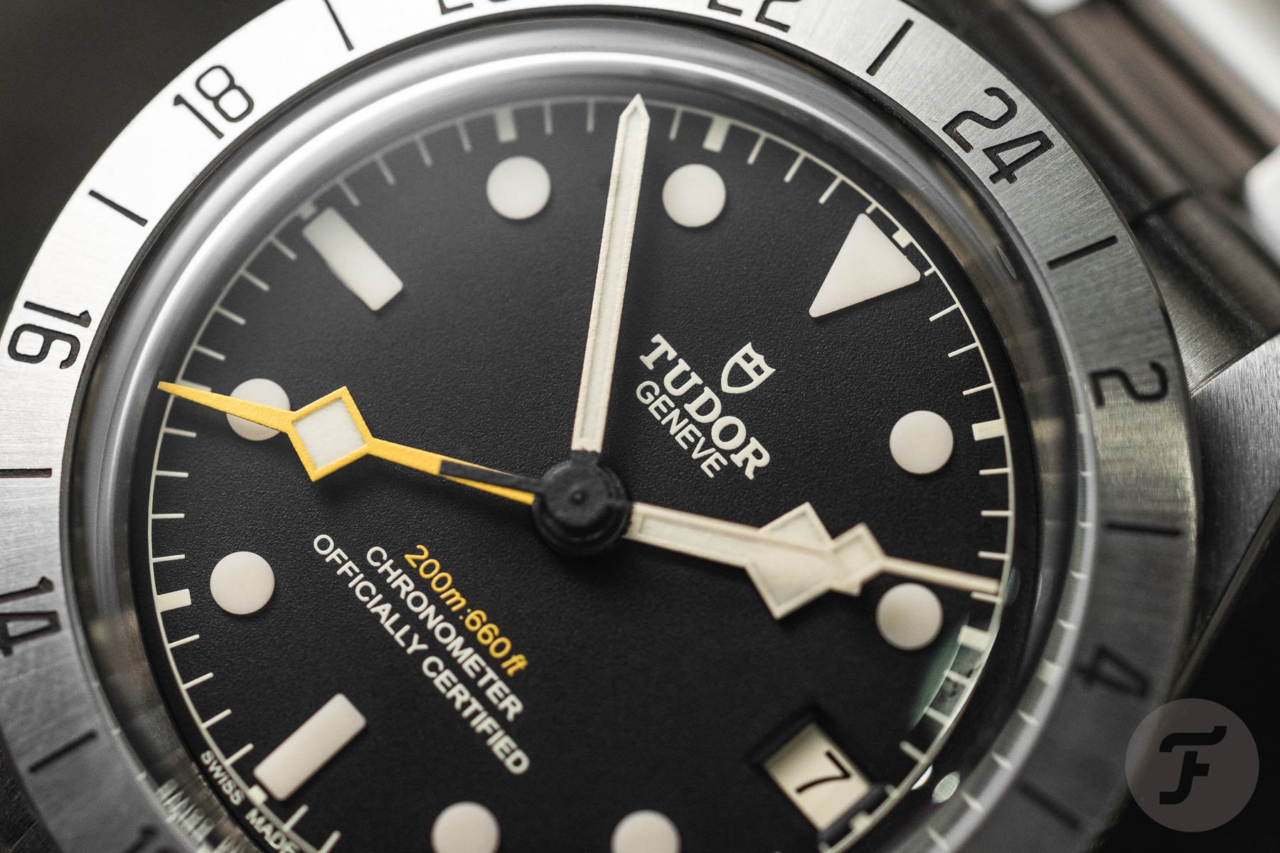
The Tudor Black Bay Pro stands as a particularly salient example of this design dynamic. The brand has been transparent about the watch’s direct inspiration: the vintage Rolex Explorer II reference 1655, often (though inaccurately) nicknamed the "Steve McQueen." The fixed 24-hour bezel, the distinctive handset, and the black dial of the Black Bay Pro are unmistakable nods to this iconic Rolex model. This lineage was so apparent upon the Pro’s debut in 2022 that it dominated much of the initial press coverage, overshadowing other aspects of the watch.
There is certainly nothing inherently wrong with drawing inspiration from horological history, and Tudor has every right to reference watches from an era when its own catalog bore a much closer resemblance to Rolex’s offerings. However, the Black Bay Pro, in its execution, arguably stops short of fully establishing its own distinct identity. It functions admirably as a high-quality homage, but it doesn’t quite achieve the same sense of inherent design equilibrium as, for instance, the Black Bay 58. This distinction becomes more pronounced with prolonged wear, as the initial excitement of the historical connection subsides.
The Overlooked Flaw: Case Thickness and Proportions
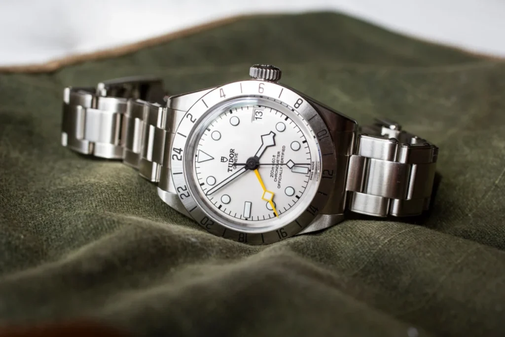
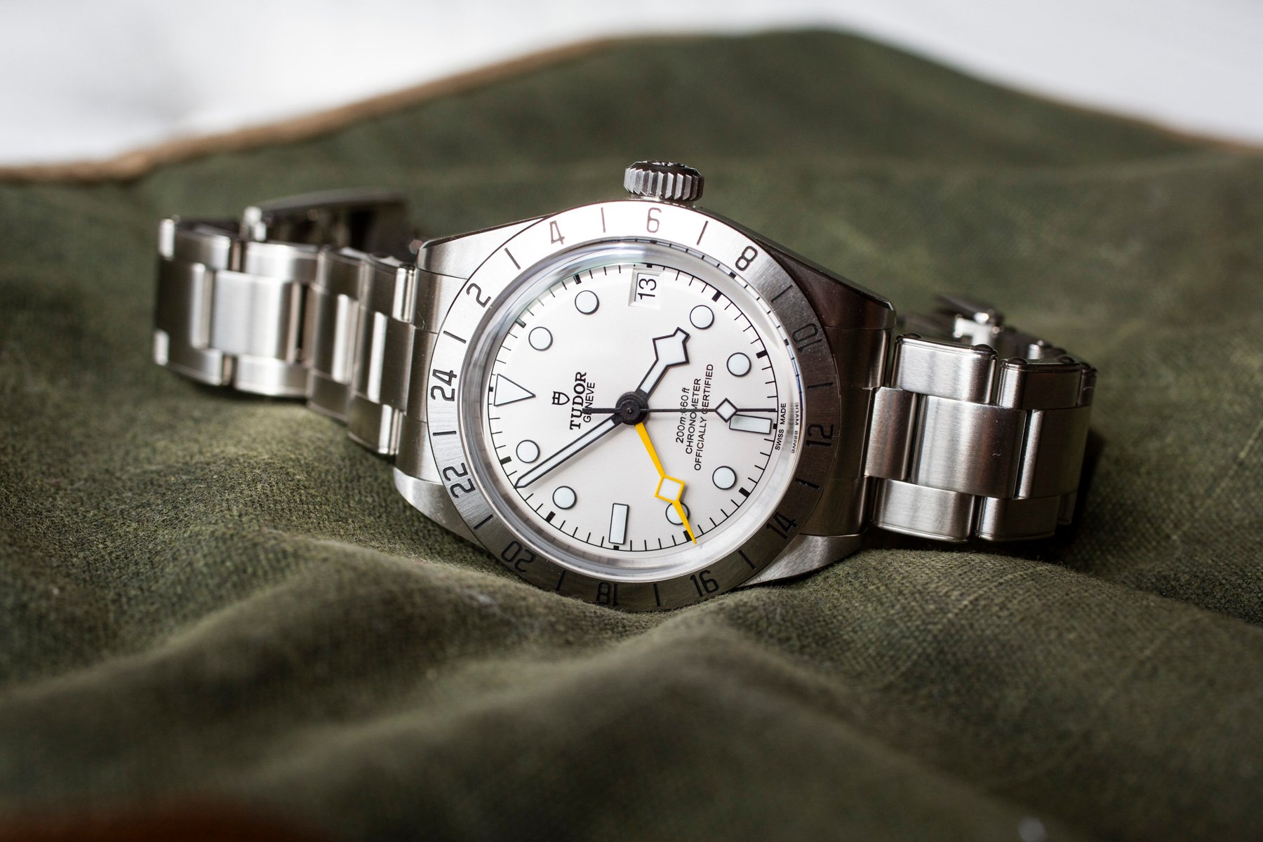
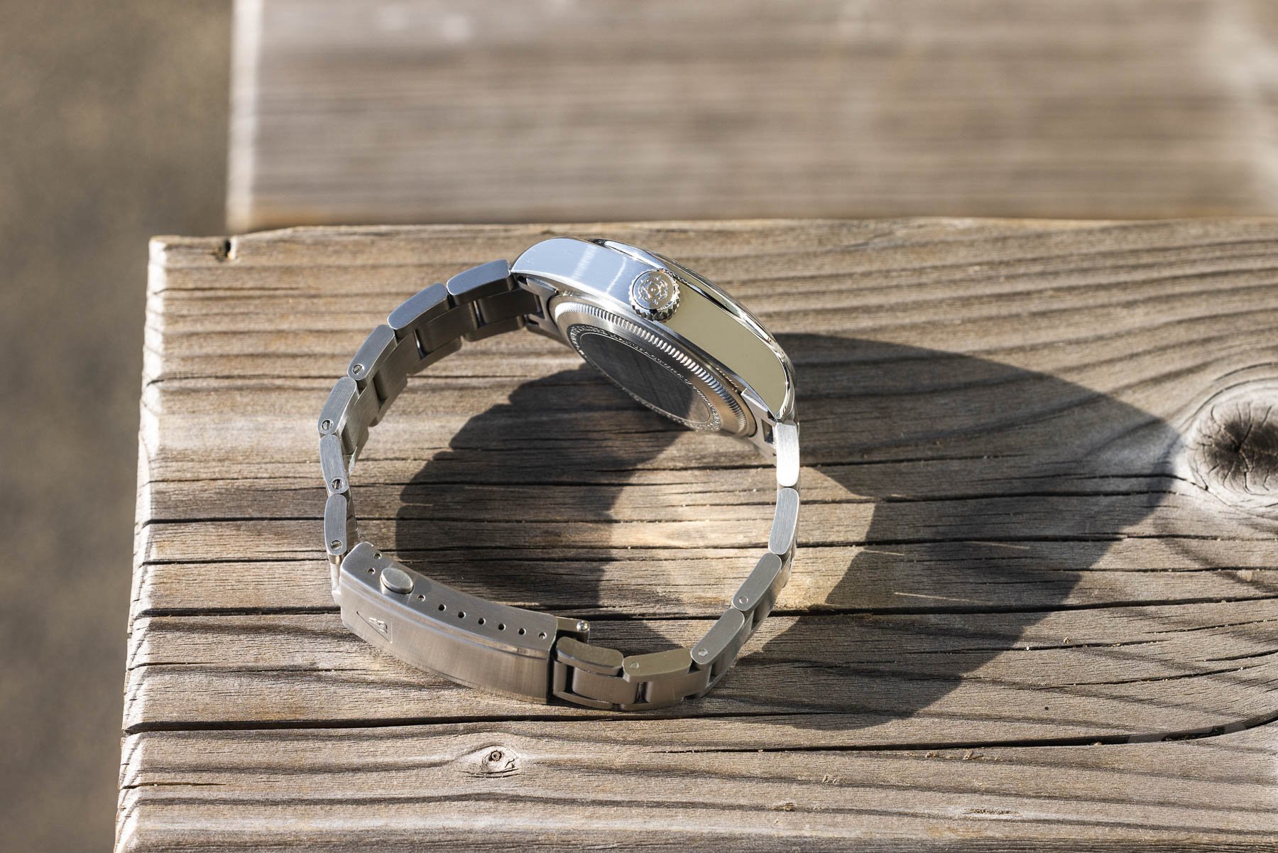
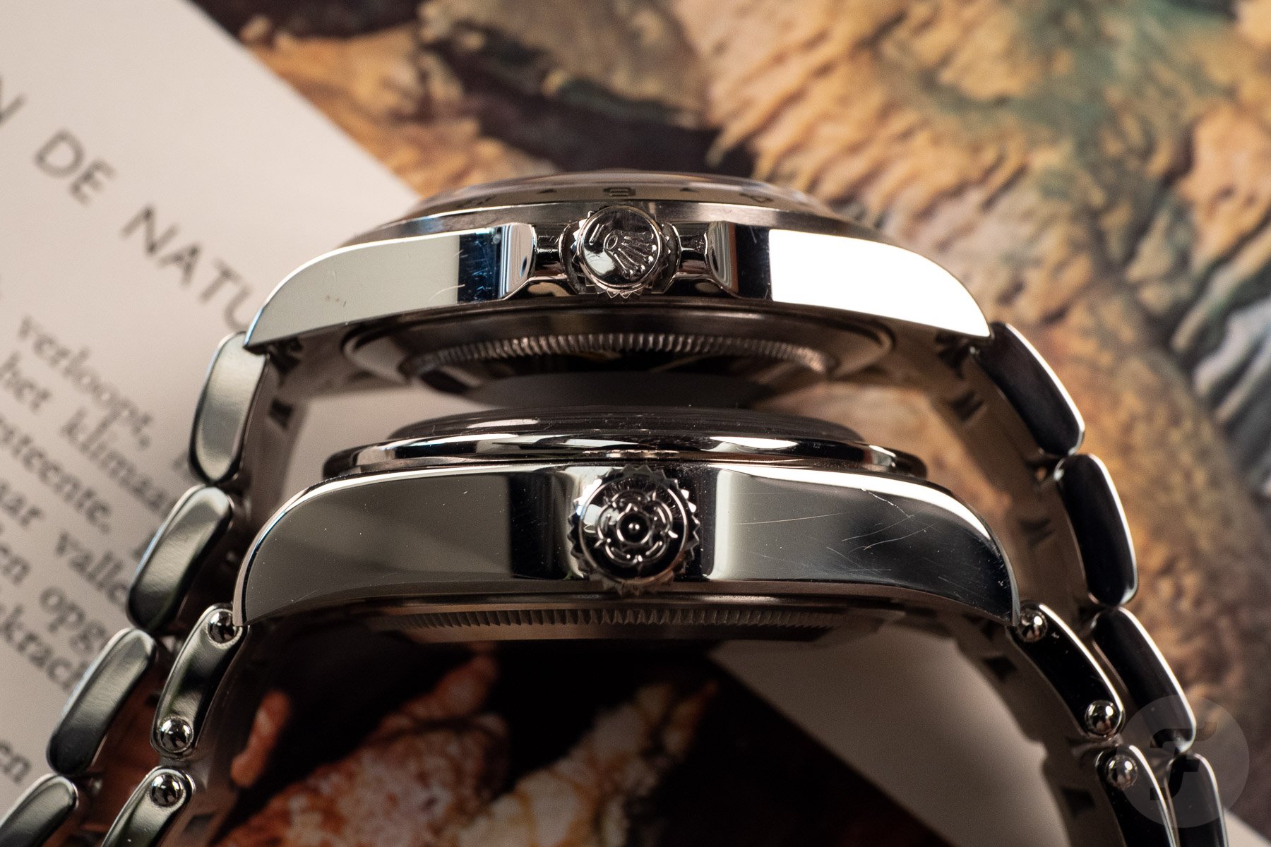
While some critics continue to focus on the Black Bay Pro’s direct visual connection to the Rolex Explorer II, a more significant design consideration, in my view, lies elsewhere. The watch, despite its generally appealing aesthetic as a robust tool watch, suffers from a case that is perceived as overly thick and top-heavy for its 39mm diameter. This issue is particularly noteworthy when contrasted with the recent release of the comparatively slim Black Bay 58 GMT, which demonstrates Tudor’s capability to produce a slimmer watch housing a GMT complication. The juxtaposition raises questions about the design choices made for the Black Bay Pro, leaving many to wonder why a more svelte profile wasn’t prioritized for a watch with such clear vintage roots, which often featured more restrained dimensions. This particular design choice serves as a prime example of Tudor presenting a potentially exceptional watch, only to introduce a characteristic that prompts head-scratching among discerning enthusiasts.
The Black Bay Chrono 39: A Bold Color Choice
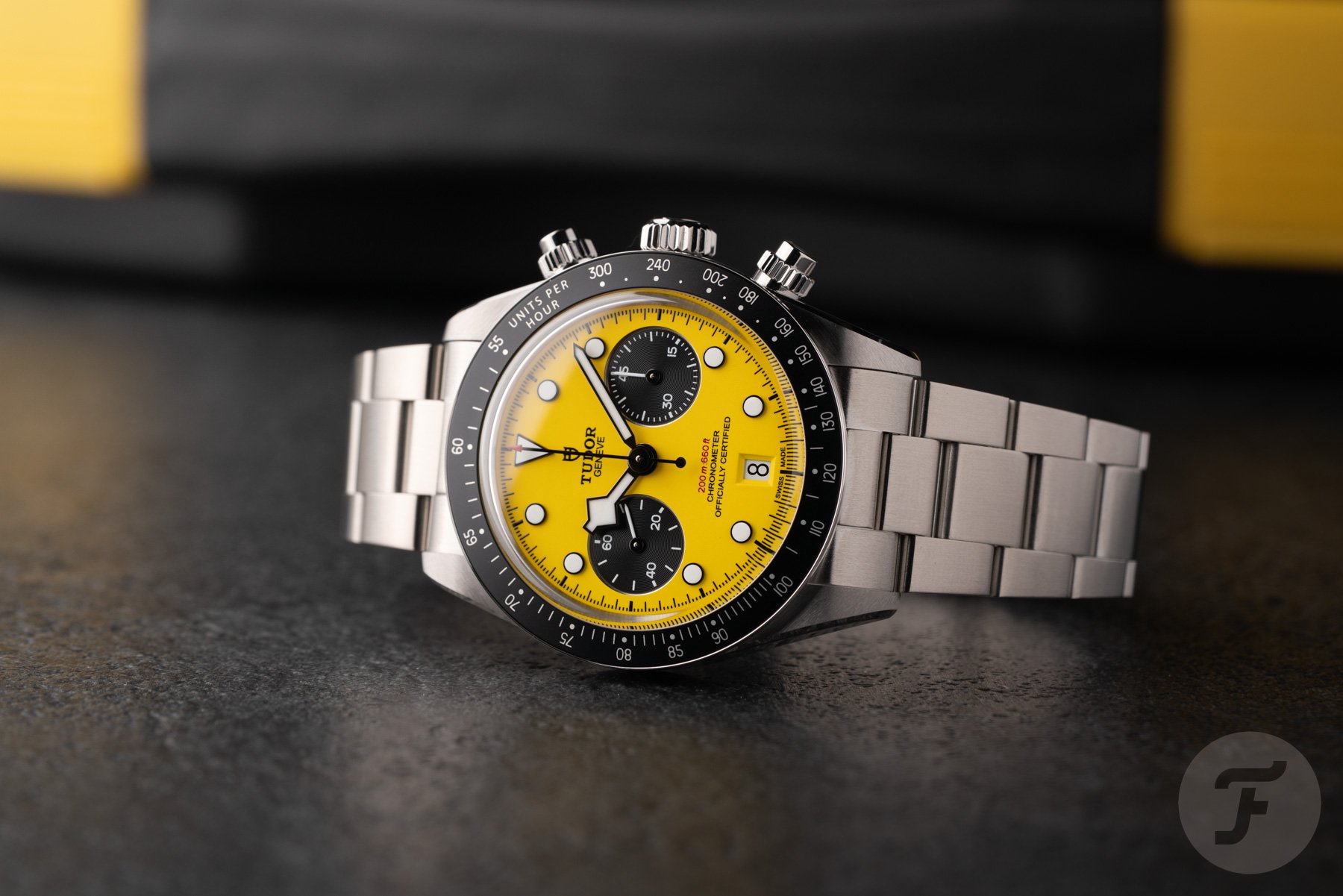
Tudor’s latest 39mm Black Bay Chrono represents a significant technical and dimensional improvement over its 41mm predecessor. The introduction of a slimmer case, a sophisticated column-wheel chronograph movement, and a more wrist-friendly size were all ingredients for a potentially instant classic. However, the initial release strategy focused exclusively on a bright yellow dial, earning it the internal nickname "Bumblebee" and positioning it within the brand’s "Daring Watches" color family.
While this vibrant yellow dial undeniably possesses a playful charm and will undoubtedly appeal to a segment of the market, its exclusive debut presents a curious design decision. Many enthusiasts anticipated a more universally accessible dial option, such as a classic black or a timeless panda configuration, to accompany the refined new case size. The decision to launch solely with a bold, unconventional color means that the new, smaller chronograph case, which addresses a long-standing demand for more wearable proportions, is initially presented through a lens of deliberate, perhaps even provocative, color choice, rather than solely on its inherent design merits.
The commercial logic of introducing a more standard, versatile dial option alongside the yellow is evident. A black or white dial would have allowed the new case dimensions to speak for themselves, potentially broadening the appeal of this refined chronograph. The current situation, where the closest modern interpretation of the classic Oysterdate chronograph series is introduced with a dial color that appeals only to a niche audience, is a point of frustration for many. It raises the question of whether Tudor is deliberately withholding more conventional options or if this is simply a characteristic of their design approach.
The Ranger: A Subtle Misstep in Lume
The current 39mm Tudor Ranger, while largely successful in capturing the spirit of its military-inspired heritage, exhibits a similar design characteristic that draws scrutiny. The case proportions, dial layout, and overall aesthetic are well-executed, resonating with the brand’s historical archives. This is also true for the 36mm version, which many consider to be the ideal size for the Ranger. However, upon closer examination, the lume application on the hour markers presents an "institutional green" hue, which contrasts with the warmer, creamy tones found on earlier iterations like the Heritage Ranger, tones that contributed significantly to their vintage appeal.
This detail, while seemingly minor, has been a consistent point of discussion on enthusiast forums and in reviews since the watch’s launch. It represents the sole element that arguably prevents the Ranger from achieving a status of unqualified excellence. A slight adjustment in the lume tint, a change that would incur no additional engineering cost and would not impact the watch’s case, movement, or price point, could have entirely removed this common criticism. Instead, this subtle, yet noticeable, design choice remains, leaving the watch just shy of perfection in the eyes of some observers.
The Rolex Factor: Strategic Restraint or Brand Identity?
The recurring theme of Tudor designs seemingly falling just short of absolute perfection prompts speculation about the underlying reasons. One theory posits that as Rolex’s sister company, Tudor has an implicit mandate to avoid directly outshining its more prestigious sibling. In this view, a minor, seemingly avoidable flaw in an otherwise exceptional design serves as a deliberate mechanism to maintain a clear distinction and prevent Tudor from being perceived as offering a "better" alternative to equivalent Rolex models. This is a compelling hypothesis, especially given the pattern observed across multiple releases.
Conversely, a more charitable interpretation suggests that these design choices are the result of independent creative decisions made by various design teams across different product cycles. These decisions, by chance or by a subtle alignment of brand ethos, tend to converge on similar outcomes. Tudor has historically cultivated an identity as the more "interesting," perhaps slightly less polished, alternative to Rolex’s austere perfection. A design that never quite settles into absolute flawlessness could, in this context, be seen as an organic expression of this brand identity, whether consciously intended or not.
The reality likely lies in a combination of both explanations. Tudor’s pricing strategy, market positioning, and overall market share undoubtedly benefit from maintaining a visible differentiation from Rolex, rather than engaging in direct competition. It would be naive to assume that commercial considerations do not influence design decisions. However, it is equally imprudent to dismiss every "quirky" lume tint or bold colorway as a calculated act of self-sabotage. These could well be genuine, albeit debatable, creative choices made on Tudor’s own terms.
Conclusion: The Enduring "Tudor Tease"
Regardless of the precise motivations, the phenomenon of the "design tease" in Tudor’s output is a tangible reality, even if its root cause remains open to interpretation. The brand consistently produces watches that are exceptionally well-designed and engineered, only to introduce a single element that prevents them from achieving unequivocal perfection. This might manifest as awkward proportions, a questionable dial color, or an unexpected lume hue. Whether this is a deliberate strategy to maintain market positioning relative to Rolex or simply an ingrained aspect of Tudor’s unique design philosophy, it is a pattern worth observing. Future Tudor releases will likely be viewed through this lens, and it remains to be seen whether this characteristic will evolve, break, or simply become an accepted part of the brand’s identity.
The central question for enthusiasts and observers alike remains: Is Tudor intentionally tempering its designs to avoid eclipsing Rolex, is this simply the inherent character of the brand, or is the perception of a flaw merely a subjective interpretation? The ongoing dialogue in the watch community suggests that this "almost perfect" characteristic is indeed a defining aspect of the modern Tudor experience, prompting continued discussion and anticipation for what the brand will offer next.