The transition from basic electronic lighting to sophisticated digital art has been accelerated by the widespread availability of addressable RGB LEDs. For many hobbyists and professional makers, the initial "rainbow" animation serves as the definitive proof of concept—a digital "hello world" that demonstrates the functionality of a microcontroller and a strip of pixels. However, as the field of creative coding matures, experts like Jason Coon of Evil Genius Labs are advocating for a shift toward more intentional and refined color palettes. By moving beyond the standard spectrum of primary colors, creators can produce installations that are not only more aesthetically pleasing but also more emotionally resonant and professionally polished.
The Evolution of Addressable Lighting
To understand the current state of LED color design, one must look at the chronology of the technology. The development of the WS2812, commonly known as the "NeoPixel," revolutionized the maker community in the early 2010s. Prior to this, controlling multiple LEDs required complex multiplexing or massive amounts of wiring. The WS2812 integrated a control circuit directly into the LED package, allowing for individual control of thousands of pixels using just one data pin.
While the hardware became accessible, the software took longer to catch up. Early libraries focused on basic functionality—turning lights on and off or cycling through the hue, saturation, and value (HSV) spectrum. This led to a decade of projects characterized by the "rainbow cycle," an effect that, while impressive in its novelty, often lacked artistic depth. Today, the focus has shifted toward high-performance libraries like FastLED and specialized controllers like Pixelblaze, which allow for the implementation of complex color palettes and mathematically driven animations.

The Physics of Color Mixing and Human Perception
The fundamental challenge in LED design lies in the gap between how machines generate light and how the human eye perceives it. An RGB LED is composed of three tiny emitters: red, green, and blue. By varying the intensity of these three components through Pulse Width Modulation (PWM), the LED can theoretically produce over 16 million colors (using standard 8-bit control).
However, pure primary colors often appear "acidic" or overly harsh to the human observer. As Jason Coon notes, a single-color blue LED often mimics the sterile, utilitarian look of a router’s indicator light. The solution lies in subtle mixing. By adding a small percentage of a second primary color—such as a touch of red to a blue field—the resulting violet or deep purple gains a "tonal warmth" that reduces visual fatigue.
Supporting this design choice is the biological reality of human vision. Human eyes perceive light logarithmically rather than linearly. This is known as the Weber-Fechner Law, which states that the perceived change in a stimulus is proportional to the initial intensity. In practical terms, the human eye can discern a tiny increase in brightness when a light is dim, but the same numerical increase is invisible when the light is already bright.
For a maker working with an 8-bit scale (0 to 255), the difference between a value of 1 and 2 is a 100% increase in brightness, which is highly noticeable. Conversely, the difference between 254 and 255 is negligible. This data suggests that the most impactful color mixing occurs at the lower end of the brightness scale. Mastering these "dim" values is the key to creating sophisticated gradients and textures that look organic rather than digital.

The Contributions of Software Pioneers
The sophistication of modern LED projects is largely due to the contributions of a few key developers in the open-source community. Jason Coon credits Mark Kriegsman and the late Dan Garcia for their work on the FastLED library. FastLED introduced the concept of "color palettes" to the Arduino ecosystem, allowing users to define a set of colors and easily map them across an array of pixels.
In more recent years, Ben Hencke of ElectroMage has pushed the boundaries further with the Pixelblaze controller. Unlike traditional microcontrollers that require a full compile-and-upload cycle for every change, Pixelblaze allows for real-time code editing via a web interface. Coon collaborated with Hencke to integrate color palette support into Pixelblaze, enabling users to swap entire color schemes instantly without rewriting the underlying animation logic.
"I worked with Ben Hencke to get color palettes added to Pixelblaze," Coon stated, highlighting the collaborative nature of the maker movement. This shift toward "palette-based" programming allows artists to focus on the mood and atmosphere of a piece rather than the low-level math required to calculate RGB values for every frame.
Strategic Color Selection: Warm, Cool, and Complementary
Choosing a color palette is as much a psychological task as it is a technical one. The impact of a project is dictated by the cultural and biological associations humans have with specific hues.

- Warm Palettes (Reds, Oranges, Ambers): These colors are inherently high-energy. They demand attention and are often used to simulate natural phenomena like fire or sunsets. In the context of "steampunk" or vintage-inspired projects, amber tones can mimic the glow of vacuum tubes or oil lamps, making them feel integrated into the hardware rather than an afterthought.
- Cool Palettes (Blues, Cyans, Purples): These tones are typically perceived as calming or futuristic. They are frequently used in "cyberpunk" aesthetics or architectural lighting meant to recede into the background.
- Harmonious Combinations: For a more professional look, makers are encouraged to use color theory principles. Complementary colors—those opposite each other on the color wheel, such as orange and teal—create a high-contrast, "pop" effect that is visually stimulating. Analogous colors—those next to each other, like green and blue—create a more serene, cohesive look.
Implementation Tools: WLED and Beyond
For those who prefer a less code-intensive approach, WLED (created by Christian Schwinne) has become the industry standard for home automation and decorative lighting. WLED is an open-source web server for ESP8266 and ESP32 boards that comes pre-loaded with hundreds of color palettes and effects. It allows users to select primary, secondary, and tertiary colors via a smartphone app, democratizing high-quality lighting design.
Furthermore, Adafruit’s CircuitPython LED library offers a more accessible entry point for those learning to code. It includes built-in color names (e.g., color::goldenrod), allowing beginners to use descriptive language rather than abstract hex codes or RGB triplets. This bridge between human language and machine code is essential for expanding the community of "creative technologists."
The Fibonacci256: A Case Study in Geometric Color
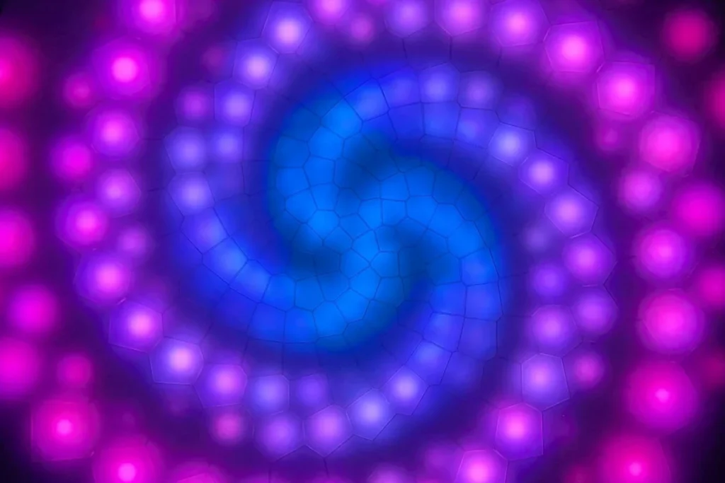
One of the most prominent examples of these principles in action is Jason Coon’s Fibonacci256. This hardware project features 256 addressable LEDs arranged in a Fermat’s spiral pattern. Because the physical layout is based on mathematical constants found in nature (like the golden ratio), the color palettes applied to it often feel more "organic."
When a standard rainbow is applied to a Fibonacci layout, the result can be chaotic. However, when a limited, high-contrast palette—such as an "Expanding HDR" fire effect—is applied, the geometry of the device is highlighted rather than obscured. This demonstrates a critical lesson for makers: the software (the color palette) must work in harmony with the hardware (the LED layout) to create a successful piece of art.

Broader Implications for Design and Industry
The move toward sophisticated LED palettes has implications far beyond hobbyist "glow-fests." In the world of interior design, "human-centric lighting" is becoming a standard. This involves adjusting the color temperature of LEDs throughout the day to match the human circadian rhythm—shifting from cool, blue-rich light in the morning to warm, amber tones in the evening.
In the entertainment industry, the use of addressable LEDs in stage design has moved away from "strobe and flash" toward "textural lighting." By using palettes that mimic natural textures—water, clouds, or stone—lighting designers can create immersive environments that feel real to the audience.
Conclusion: Making the Project Unique
The final stage of LED mastery is personalization. While libraries like FastLED and WLED provide excellent "starter" palettes, the ultimate goal for any maker is to create a signature look. As Jason Coon points out, relying solely on presets can lead to "showing up at the party wearing the same code as someone else."
By understanding the logarithmic nature of light, leveraging advanced software libraries, and applying basic color theory, makers can transform a simple strip of lights into a sophisticated medium for expression. The effort spent refining a palette in software is often what determines whether a project is viewed as a "gadget" or a work of art. As addressable lighting continues to evolve, the distinction between the two will increasingly rely on the creator’s ability to move beyond the rainbow.